
Number Nerds
Bookkeeping clarity that wins trust and booked calls.
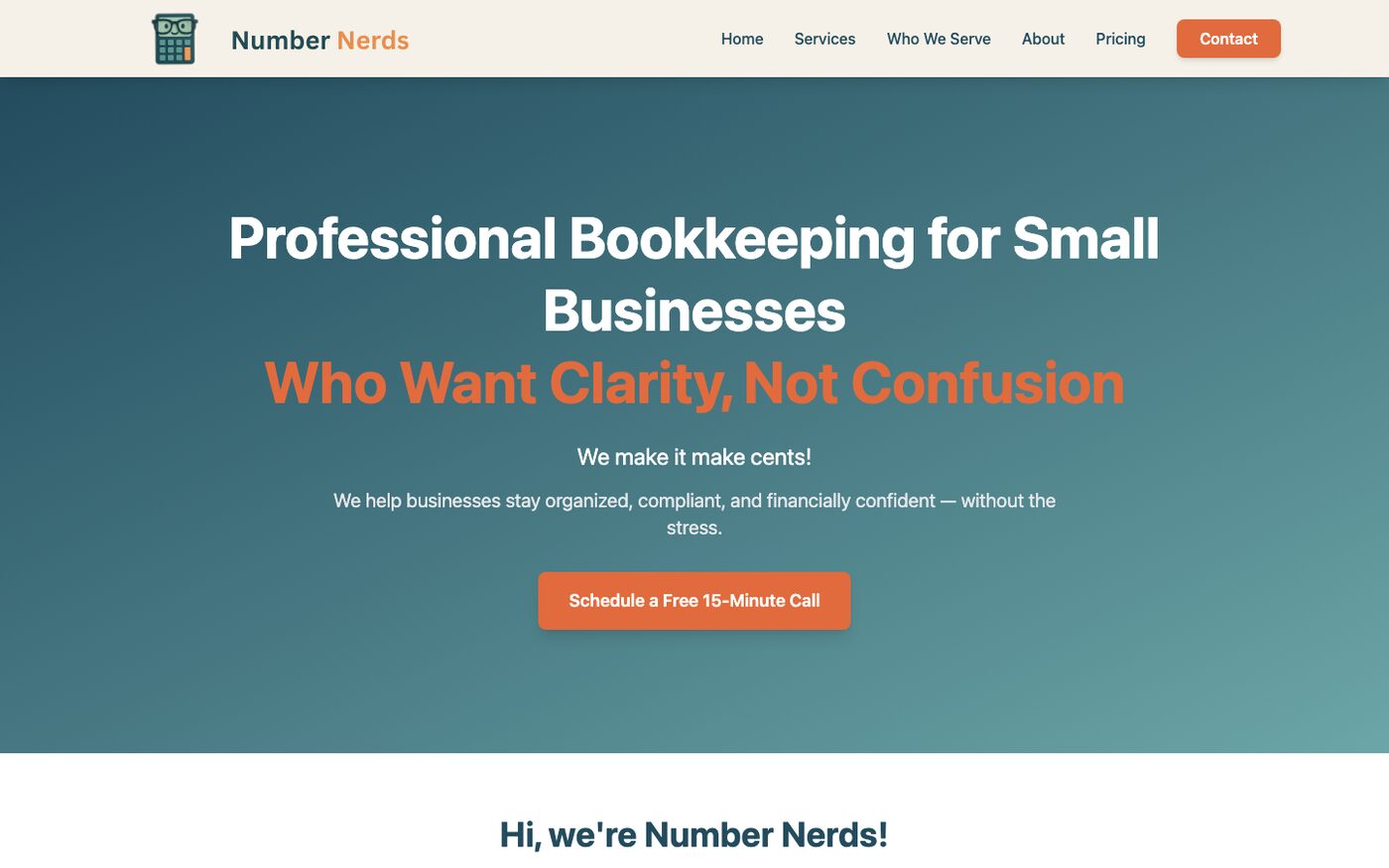
A professional bookkeeping brand site built from scratch with the client in the loop at every turn — services, story, and a free 15-minute consult as the clear next step.
- Typical cost
- ~$750
- Timeline
- 1–2 weeks
- Tier
- Starter site
www.number-nerds.net
The challenge
Number Nerds needed a home on the web that felt warm enough for stressed small-business owners and sharp enough for payroll, catch-up work, and CPA-ready books. There was no old site to lean on — just a clear vision and a lot of trust to earn.
Our approach
This was a fresh build. We brought the client along at regular intervals — reviews, feedback, small course-corrections — so the site stayed true to their voice and nothing important landed as a surprise at the end.
The outcome
A friendly, professional multi-page site that explains the offer without jargon and makes booking a free consult feel easy and natural.
What we built
Inside the build
A look at how the project took shape — the decisions, the work, and what visitors feel when they land.
Starting from a blank page — together
Number Nerds was a fresh project. That meant we could shape the brand story cleanly, but it also meant every decision mattered — voice, services, who they serve, how the consult ask should feel.
So we didn’t disappear for weeks. We included the client throughout the build at regular intervals: share progress, gather feedback, adjust, keep moving. Transparency made the work better, and the relationship easier.
Finding a voice that feels like them
The brand walks a careful line — approachable (“we make it make cents”) without sounding casual about money. Together we landed on headlines and copy that invite stressed owners in while still signaling real competence.
Those check-ins kept the tone honest. If something felt off-brand, we caught it early.
Laying out the services people actually need
Monthly bookkeeping, payroll, catch-up clean-ups, QuickBooks help, CPA-ready statements — the offerings had to be scannable, not overwhelming.
We shaped service cards and supporting pages in conversation with the client, so the site reflected how they really talk about their work with customers.
Building trust in public
An about story, a sense of who they help, and pricing presented with calm clarity. Fresh brands need that human layer — visitors should feel they’re meeting a team, not a template.
Regular reviews helped us keep that warmth consistent from home page to contact.
A clear, low-pressure next step
The whole site points toward one gentle ask: schedule a free 15-minute call. Because the client stayed close during the build, that CTA felt like their invitation — not something we bolted on at the end.
That’s the quiet power of building in the open: the finished site already sounds like the people behind it.
How we shipped it
Build process
-
1
Discovery
We sat with goals, services, and brand voice — then agreed on a cadence for reviews throughout the build.
-
2
Design
A warm visual system took shape, with early client feedback before anything went too far.
-
3
Build in chapters
Pages shipped in intervals — home, services, about, pricing, contact — with check-ins between each pass.
-
4
Launch
Final polish together, then handoff with a site the client already recognized as theirs.
Stack & capabilities
- Rails
- Tailwind CSS
- Multi-page marketing structure
- Contact / consult CTA
- Service & pricing pages
- Brand-forward visual system
- Collaborative client process
Deliverables
- Fresh multi-page bookkeeping website
- Collaborative build process with regular client reviews
- Services & audience pages
- About / trust storytelling
- Consult booking CTA flow
- Pricing presentation
- Launch support
Next step
Want something in this range?
Tell us what you’re building — we’ll recommend a tier and a clear estimate before any commitment.